by Alyssa Craft | Aug 25, 2014 | Design
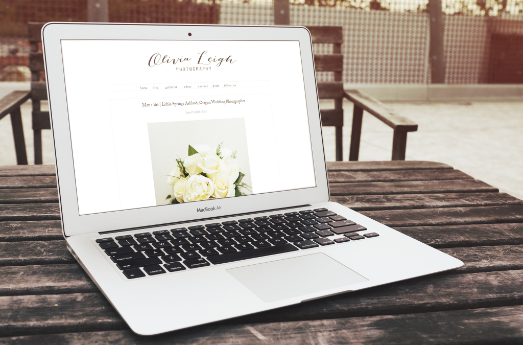
Today I would like to talk about minimalism in design, how sometimes “less is more”, and how taking a minimalist approach can help your marketing and ultimately, your business. To do this, I would like to highlight one of our clients, Olivia Leigh Photography. She takes a minimalist approach to her website and in doing so, the star of the show is her photography and not a “flashy” website that steals the attention. Here are three lessons in minimalism we can learn from the style of her website, and how ideas of minimalism can benefit your business. Lessons in Minimalism 1. Use of blank space Olivia’s photography is outstanding, and she knows to let her photographs shine. By having a site with a lot of blank space, or “white space”, 100% of the attention is on her photos. I have seen multiple photographers (and many other small business for that matter) that try to do too much with their websites and and everything ends up competing for attention. 2. Use of subtle fonts The fonts used on her website are very complementary to the photos and not distracting. Often, people want to use bold, exciting fonts for fear of being boring or traditional, but this is not always a good idea. Good typography is often one of those things that people don’t notice when it looks good, but everyone notices when it is bad. Good typography should help to support the message, or the photos in this case, but not steal the spotlight. 3. Use of a subtle logo Olivia’s logo is fairly subtle but elegant. While...
